Occupancy heat map

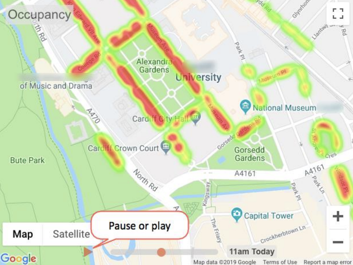
The occupancy heat map is a graphical representation of current parking data. The red shows areas that are high occupancy.
The image shows a video of activity for the last 24 hours. You can pause the video to take a longer look at a particular point in time.
Parking occupancy gauge

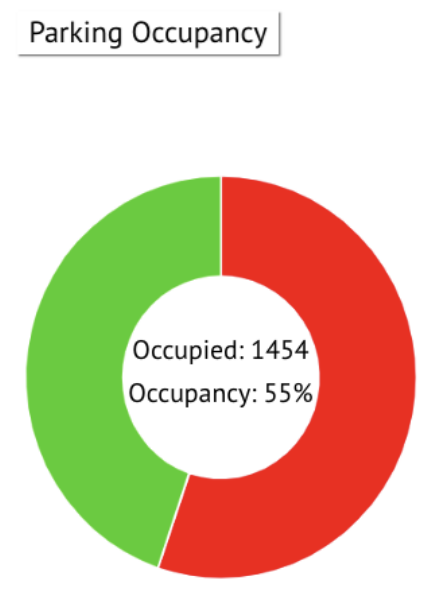
The parking occupancy gauge shows the real number of occupied bays as well as the percentage of occupied bays across the whole site.
Movement heat map

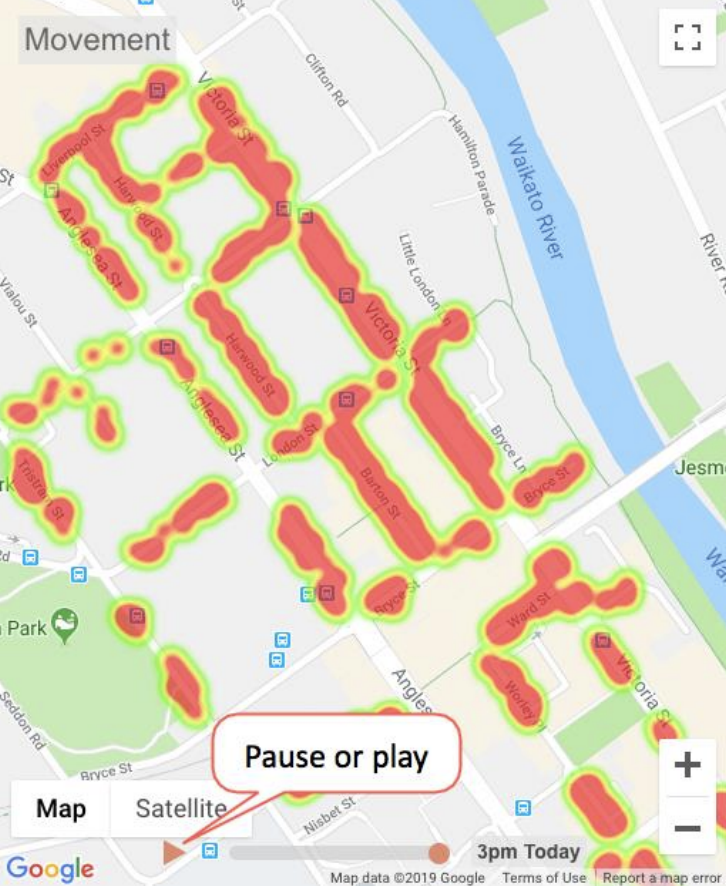
The movement heat map shows movement for different areas. The red shows areas that have a high concentration of vehicles arriving and departing.
Although the occupancy and movement heat maps usually look similar during the day, they will often look different at night or in the early hours of the morning. During those times the occupancy heat map of an area will show red while the movement heat map will be green or not showing many heat areas since vehicles are not coming and going.
The image shows a video of activity for the last 24 hours. You can pause the video to take a longer look at a particular point in time.
Note: This tile isn't on the default dashboard. You can add it to your SmartPark default dashboard, or create a new dashboard with the tiles that you want to view. See Add a new tile to a dashboard.
Comments
Please sign in to leave a comment.